Client
Nursing Care Facility Network
Industry
- Health & Life Sciences
Technology
- Tableau
Services
- Data Visualization
- Data Integration
- Digital Transformation
About the Client
A network of nursing-care facilities providing high-quality long-term and short-term care, rehabilitation, in-home support and specialty services for seniors, with 12 locations throughout New England.
Challenge
- Siloed data sources
- Data aggregation was very time-consuming
- Resource availability uncertain
- No in-house IT/analytics staff
As COVID-19 cases threatened to overburden this renowned nursing care network, executives needed to gain full visibility of occupancy and capacity across 12 locations. Manual data collection, isolated analytics and a pervasive “spreadsheet culture” inhibited the organization’s efforts to attain a holistic view of relevant hospital resources, like hospital beds and nursing staff.
Each facility was using the same EMR application to track metrics like patients in the unit, length of stay, time-to-provider and delays in admissions, but the data was siloed, not available in real-time and only shareable in spreadsheet format. And without dedicated IT and analytics staff in-house, clinicians were spending valuable time trying to analyze the spreadsheet data.
Juggling the disparate data sources, inefficient processes and wasted resources had the potential to increase overall costs and decrease the quality of the patient experience. The healthcare network needed an intuitive solution to access, visualize and share data about hospital resources.
Strategy & Solution
- Aggregating data across siloes
- Delivering full visibility into regional bed utilization
- Automated reporting
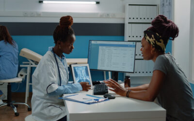
It’s easy to feel limited by data when it’s sitting in a spreadsheet. But turn that data into a visualization, and it transforms into a meaningful story that’s easy to understand and share. With this in mind, Ciberspring implemented the powerful analytics platform Tableau into the organization’s tech stack to connect the facilities’ siloed data sources.
Working with health-system leadership, we created intuitive and accessible dashboards in Tableau to bring key reporting metrics to life across programs, facilities and regions. In just a few clicks, registered users can combine data sources, add filters and drill down into specific information on demand. This approach allows for multi-level comparisons, so leadership can swiftly make informed decisions on how to efficiently allocate resources within their system.
Mindful of COVID-19 safety protocols, the dashboards also track and visualize the location of COVID-19 positive patients, patients under investigation and COVID-19 negative patients. By keeping facility management and company leadership informed, they can make the most of scarce resources like staff, virus-free spaces and personal protective equipment in a time of exponential demand.
Results
- Near real-time view of patient occupancy
- Visibility into regional metrics
- Improved occupancy management
The centralization, automation and visualization of key metrics has empowered the regional team to better understand their data, manage facility flow and make more informed decisions. The health network is now able to leverage automated self-reporting to visualize the data in multiple formats for multiple locations in near real-time view. With a trusted partner and enhanced visibility, our client is poised to continue optimizing their services and reducing costs.